Wednesday, May 29, 2013
Final Conclusion
During my semester in art I have learned so much. My favorite project would have to be the ceramics because i really loved getting to have some freedom in designing the clay piece whichever way we wanted. I also enjoy hands on projects. My least favorite project we did would be the Self portrait. Mainly because I don't really like drawing myself and mine turned out to look nothing like me which was sort of disappointing. throughout art i have learned alot about the importance of shadowing and adding value to a drawing. It can make a huge difference in the final product. One big thing I learned was that the warm ups we did in our sketch books were important because they helped with the main project we would be doing in that lesson, and if you missed doing the warm up it could effect the way your final project would come out because you didn't do the warm up. In addition to that I learned that good things take time. For instance you cant finish a drawing in one day because you can always go back and add more things to it or just prefect it more. One other thing i really enjoyed about art was how you got to express your creativity and draw things you never imagined you could have drawn before. During art my true creativity really shined through my artwork. To conclude art this year was very fun and taught me alot.
Blog entry #2
 Ceramics Project
 Blog Entry #4

Logo (Free Choice)
I created my logo by using my first and last name initial then my middle name which is Kay to create a logo that expresses music. So first start off this project I had to make the lettering very big and dark so when the computer shrunk it down it would still look neat and clean. the music notes across the top of the logo represent how SMK would be a brand of musical instruments. The infinite sigh at the end shows how the musical instruments will always work and if theirs a problem you can get it fixed because there is an infinity refunds for the product. my logo uses monochromatic colors because there is only white and black used. the shading in the M makes my logo pop out more and catch the viewers attention. the final step to my Logo was shrinking it down into the computer so if there were any slight mistakes they would be shrunken and blended in. To conclude my logo was made with creativity and effort and shows how time payed off.
Blog Entry #1

Pastel Still life Project
I planned out my composition by having balance with the four different types of nail polishes and the shapes of them. I choose four items that would all look good together. The unity of the nail polishes creates a calm mood with the balance of colors and arrangement of the polishes.A thumb nail sketch is basically a brief sketch of the big picture.It helped me organize how i wanted my final drawing to look. A view finder helps you focus the whole scene and help determine the pastels work orientation.t The viewfinder showed me how i wanted to arrange my 4 objects. I had to try many different ways to see which one suited my expectations best. My items were nail polish bottles so they were oval shaped. Many items in my pastel drawing appear 3-dimensional, this is created by
coloring different parts lighter or darker , also known as value. In addition to that I used contour lines to help give my objects a rounded like shape to make them appear more 3D. I used a creative light source which gave me the idea of creating cool shadows which just pull the whole picture all together.
Blog Entry #5
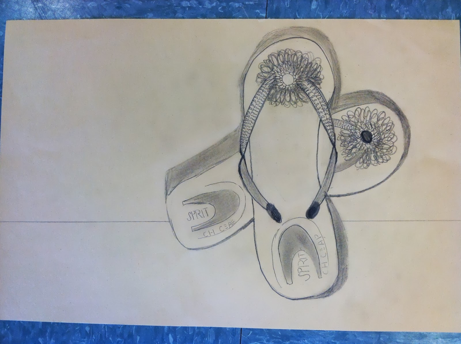
Shoe Drawing (Free Choice)
This drawing was made by looking at a pair of two flip flops and then drawing them. I started by drawing the flip flop that was behind the other one. The shadowing of the flip flop helps show that one of them is behind the other. In this drawing I had to make sure I added every detail including the small writing on the heel of the shoe. The flip flops had a thick base which meant i had to shade it in at the bottom so the shoe looked like it had a thicker base to it. I made sure the flip flop straps were made to look like they were turned inward as you can see in the picture. This drawing also has monochromatic coloring because the paper and pencil were the only colors used. I shaded the flower darker to help make it appear larger and more popping to the eye.
Tuesday, May 21, 2013
Blog Entry #3

Acrylic Landscape Painting
I organized my painting by creating a background by mixing hot oranges and cool blues to create a desert atmosphere. I found my inspiration for my picture in the TIME magazine. my composition pulls the viewer in to look at the hot desert like view. There is movement in my painting in the sky, the different shades of blue form to create an atmosphere of a hot breezy blue sky. The main focus in my painting goes to the pom trees, they are viewed as in front of the buildings in the far background. I proportioned the trees to be bigger than everything else because they are of main focus. I made the buildings small so the pom trees would like like they are in-front of the buildings. My light source was put in the left corner meaning the trees shadow would be facing the right and be slanted. i used many different brush strokes, for the pom trees i used a small pointy brush and did light strokes, for the sky I used a thick brush with side to side strokes to create and ombre of blues. To conclude value was used throughout my painting the desert hills have a mix of warm oranges at the bottom and cool oranges at the top. the tree trunks ave mixes of browns with tints of green in them.
Subscribe to:
Posts (Atom)